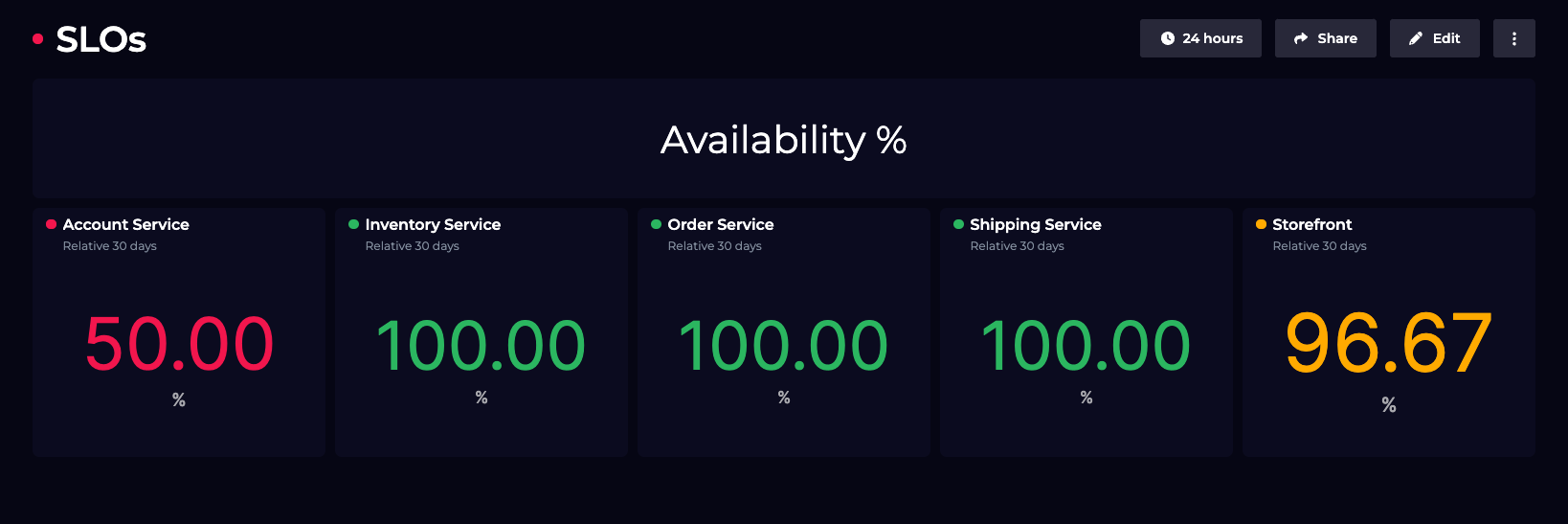
As part of our ongoing work to extend and improve our visualizations, we've made several improvements to the Scalar visualization, as well as several UI improvements to bring it in line with other visualizations.
- Manual sizing: You can now set a manual size for your scalar text on your dashboard
- Monitoring: For Scalar tiles with monitoring enabled, we'll now highlight the scalar based on the health state.